
Most web apps these days either display some sort of data on pages or they collect data from users using forms. This means every SPA framework must need to support data binding so that developers can bind data with elements such as labels, form controls, etc. Blazor components have built-in support of data binding and they support both one-way and two-way data binding using multiple techniques. In this tutorial, I will cover the fundamentals of Blazor data binding features with a simple card designer example where the user will be able to see his card design updated in real-time.
One Way Binding
In one-way data binding, the data flows in one direction. The application code updates the value in response to some event or user action and when the value is updated, the corresponding UI is updated dynamically. In one-way data binding, the user is not allowed to change the value directly. In Blazor, we typically use @ symbol followed by the property, field, or even a method to implement one-way data binding. For example, if you have a Title property in your code and you want to bind it with an h1 element then you can write code similar to the following snippet.
<h1>@TItle</h1>
Now to update the Title in the code you can use a simple button onclick event that can call a method UpdateTitle in the code to update the value of the Title property. As soon as, the user will click the button, the h1 element text will update automatically because the updated value will automatically flow from the code to the user interface.
<button @onclick="UpdateTitle">Update Title</button>

@code{
    public string Title { get; set; } = "Hello";

    private void UpdateTitle()
    {
        Title = "Hello, Blazor!";
    }
}
Two Way Binding
In two-way data binding data flows in both directions. Typically user updates the value in some form on the front-end and the value is automatically updated in the code at the back-end, then this updated value flows to UI and updates all elements bind to that value. In Blazor, two-way data binding can be achieved using the @bind attribute which can be used in several ways. The following simple example demonstrates the basic usage of the @bind attribute where we are using @bind=Property syntax to bind Title property with an input element.
<h1>@Title</h1>

<input @bind="Title" />

@code {
    public string Title { get; set; } = "Blazor";
}
We can also bind a certain property to a specific event so that the property value only updates when that particular event occurs. The syntax of binding to a specific event is @bind:event=”EVENT NAME”. For example, in the following code snippet, I only want to change the Title property if the user moves the focus away from the input field.
<h1>@Title</h1>

<input @bind="Title" @bind:event=”onchange” />

@code {
    public string Title { get; set; } = "Blazor";
}
We now have a basic knowledge of Blazor data binding so, in the remaining tutorial, I will show you some real-world examples of using data binding. Before we start, please make sure that you are familiar with creating and using Blazor components. If you don’t know how to create a Blazor app or component, I will recommend you to read my previous post A Beginner’s Guide to Blazor Components.
Getting Started
Create a Blazor Server app in Visual Studio 2019 and add a new Blazor component CardDesigner.razor in the Pages folder. We want to build a simple card designer page that will allow the user to design and preview the card at the same time. Let’s add the following HTML markup in the razor view of our newly created component.
CardDesigner.razor
@page "/"

<h1>Card Designer (Blazor Data Binding)</h1>

<div class="container">
    <div class="row">
        <div class="col-8">
            <h3>Design</h3>
            <form>
                <div class="form-group">
                    <label for="Heading">Heading</label>
                    <input type="text" class="form-control" id="Heading">
                </div>
                <div class="form-group">
                    <label for="Description">Description</label>
                    <textarea class="form-control" id="Description" rows="4"></textarea>
                </div>
                <button class="btn btn-secondary mb-2">Reset</button>
            </form>
        </div>
        <div class="col-4">
            <h3>Preview</h3>
            <div class="card bg-light w-100">
                <div class="card-header">
                    Heading
                </div>
                <div class="card-body">
                    <p class="card-text">
                        Description
                    </p>
                </div>
            </div>
        </div>
    </div>
</div>
You also need to add some basic CSS styles to wwwroot/css/site.css file to make sure our card designer looks pleasing to the eyes.
site.css
.container {
    margin: 15px;
    padding: 0px;
}
.col-8, .col-4 {
    border: 1px solid #dadada;
    padding: 10px;
}
h1 {
    font-size: 22px;
    font-weight: bold;
    margin-bottom: 30px;
    margin-top: 20px;
}
h3 {
    font-size: 18px;
    font-weight: bold;
    margin-bottom: 25px;
}
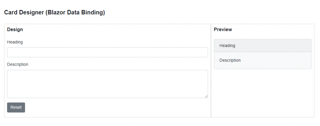
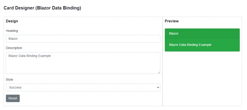
Run the app and you should be able to see a page similar to the following. The left-hand side is the Design section that will allow the user to set the Heading and Description of the card and on the right-hand side, we are showing the card preview. There is also a Reset button that will reset the form to default values.
Let’s create a separate code-behind partial class for the implementation logic of our card designer. The class has two simple properties Heading and Description with some default values. There is also a method ResetCard that we will call when the user will click the Reset button and this method will reset both properties to their default values.
CardDesigner.razor.cs
public partial class CardDesigner
{
    public string Heading { get; set; } = "Heading";
    public string Description { get; set; } = "Description";

    public void ResetCard(MouseEventArgs e)
    {
        Heading = "Heading";
        Description = "Description";
    }
}
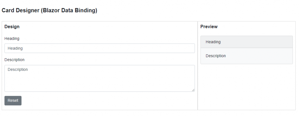
We are now ready to see Blazor data binding capabilities in action. Let’s start with one-way data binding first. Let’s update the above <form> code slightly and add one-way binding using @ symbol with the property names. I am binding the value attribute of input and textarea elements with the Heading and Description properties and then I added the @onchange event to change the Heading property using the Lambda expression syntax. I also attached the ResetCard method with the onclick event of the Reset button.
CardDesigner.razor
<form>
   <div class="form-group">
      <label for="Heading">Heading</label>
      <input type="text" class="form-control" id="Heading" value="@Heading"
         @onchange="@(e => { Heading = e.Value.ToString(); })">
   </div>
   <div class="form-group">
      <label for="Description">Description</label>
      <textarea class="form-control" id="Description" rows="4"
         @onchange="@(e => { Description = e.Value.ToString(); })" value="@Description"></textarea>
   </div>
   <button type="button" class="btn btn-secondary mb-2" @onclick="ResetCard">Reset</button>
</form>
We also need to update our Preview section card with one-way data binding so that every time the Heading or Description updates in the code the Preview section automatically renders the updated values on the card.
CardDesigner.razor
<div class="card text-white w-100 @SelectedStyleCssClass">
   <div class="card-header">
      @Heading
   </div>
   <div class="card-body">
      <p class="card-text">
         @Description
      </p>
   </div>
</div>
If you will run your application now, you will see an output similar to the following. Try to input some heading and description in the Design area and you will notice that as soon as you will leave the focus or move away from the input field, the Preview area will update automatically on the fly.
If you are not a fan of using Lambda expressions in HTML, you can also define UpdateHeading and UpdateDescription methods in your code and then these methods can be associated with @onchange events.
CardDesigner.razor
form>
   <div class="form-group">
      <label for="Heading">Heading</label>
      <input type="text" class="form-control" id="Heading" value="@Heading"
         @onchange="UpdateHeading">
   </div>
   <div class="form-group">
      <label for="Description">Description</label>
      <textarea class="form-control" id="Description" rows="4"
         value="@Description"
         @onchange="UpdateDescription"></textarea>
   </div>
   <button type="button" class="btn btn-secondary mb-2" @onclick="ResetCard">Reset</button>
</form>
CardDesigner.razor.cs
public partial class CardDesigner
{
    public string Heading { get; set; } = "Heading";
    public string Description { get; set; } = "Description";

    public void ResetCard(MouseEventArgs args)
    {
        Heading = "Heading";
        Description = "Description";
    }

    public void UpdateHeading(ChangeEventArgs e)
    {
        Heading = e.Value.ToString();
    }

    public void UpdateDescription(ChangeEventArgs e)
    {
        Description = e.Value.ToString();
    }
}
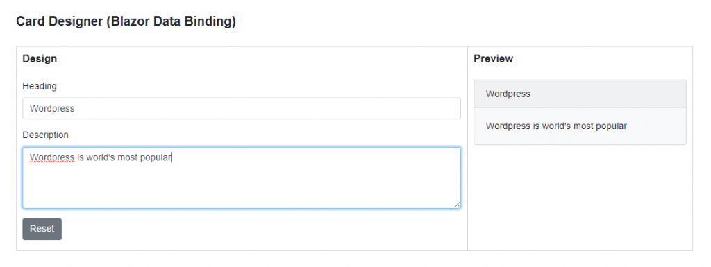
So far, we are only using one-way binding in our application because the value of Heading and Description properties are updating inside our code and our code only executes if the user leaves focus from the form controls. Let’s update the code of our example and see how we can use two-way data binding with our example. Use the @bind attribute to bind the Heading and Description properties with the form controls. I also want the card Preview to be updated instantly as soon as the user starts typing in the form controls. To achieve this, add @bind:event=”oninput” to the input and textarea controls.
CardDesigner.razor
<form>
   <div class="form-group">
      <label for="Heading">Heading</label>
      <input type="text" class="form-control" id="Heading" @bind="Heading" @bind:event="oninput">
   </div>
   <div class="form-group">
      <label for="Description">Description</label>
      <textarea class="form-control" id="Description" rows="4" @bind="Description" @bind:event="oninput"></textarea>
   </div>
   <button type="button" class="btn btn-secondary mb-2" @onclick="ResetCard">Reset</button>
</form>
Now the two-way binding is in place so we don’t need to manually update the properties so we can remove the UpdateHeading and UpdateDescription methods from the code.
CardDesigner.razor.cs
public partial class CardDesigner
{
    public string Heading { get; set; } = "Heading";
    public string Description { get; set; } = "Description";

    public void ResetCard(MouseEventArgs args)
    {
        Heading = "Heading";
        Description = "Description";
    }
}
Run the app again and input the heading and description in the Design form and see how the card preview is updating automatically.
Let’s extend our example further and introduce a dropdown control in the Design area. This dropdown will display different card styles and the user will be able to select and apply any card style instantly using two-way data binding. Let’s add the following StyleInfo class in the Data folder.
StyleInfo.cs
public class StyleInfo
{
    public string Name { get; set; }
    public string CssClass { get; set; }
}
Let’s add two more properties in our CardDesigner.razor.cs file to store the list of available card styles and to store the reference of the selected style. We are initializing the Styles property in one of the component initialization methods named OnInitialized. The OnInitialized method is invoked when the component is initialized after having received its initial parameters from its parent component.
CardDesigner.razor.cs
public partial class CardDesigner
{
    public string Heading { get; set; } = "Heading";
    public string Description { get; set; } = "Description";
    public List<StyleInfo> Styles { get; set; }
    public string SelectedStyleCssClass { get; set; }

    protected override void OnInitialized()
    {
        Styles = new List<StyleInfo>()
        {
            new StyleInfo() { Name = "Primary", CssClass = "bg-primary" },
            new StyleInfo() { Name = "Secondary", CssClass = "bg-secondary" },
            new StyleInfo() { Name = "Success", CssClass = "bg-success" }
        };

        SelectedStyleCssClass = "bg-primary";
    }

    public void ResetCard(MouseEventArgs args)
    {
        Heading = "Heading";
        Description = "Description";
    }
}
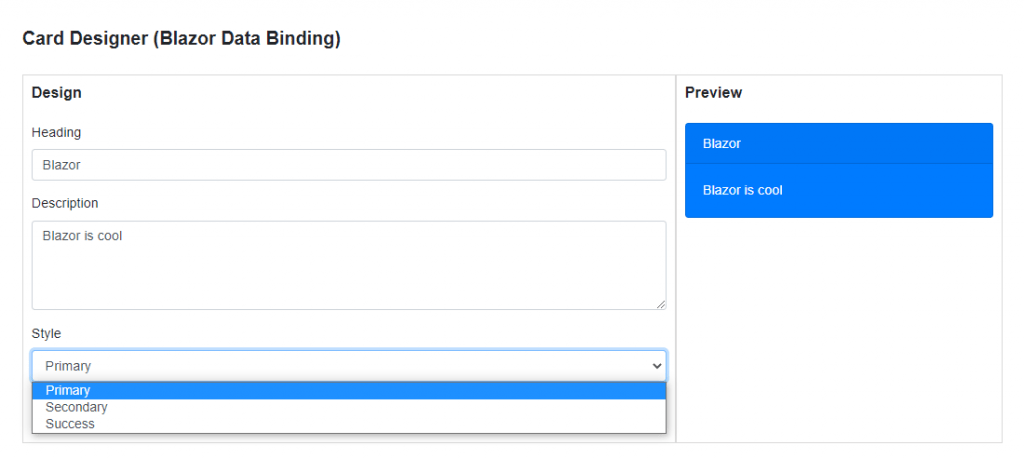
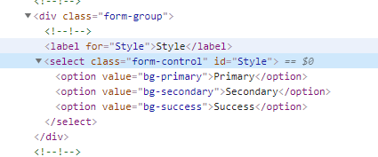
Finally, we need to add an HTML select element in our CardDesigner.razor file. We are running a simple @foreach loop to iterate over the Styles property and creating <option> element inside the loop. The value attribute of the <option> element will render the CssClass property value and the text of each <option> element will render using the Name property.
CardDesigner.razor
<div class="form-group">
   <label for="Style">Style</label>
   <select class="form-control" id="Style" @bind="SelectedStyleCssClass" @bind:event="onchange">
      @foreach (var style in Styles)
      {
      <option value="@style.CssClass">@style.Name</option>
      }
   </select>
</div>
In the above code snippet, we are binding the SelectedStyleCssClass property with the select element using the @bind attribute and we have decided to use the onchange event with select so that every time the user selects an option from the dropdown the card style update automatically.
If you will run the project now you will see the styles populated in the dropdown and a selected style is also applied to the card in the Preview section.
Right-click on the select element and choose Inspect menu option to see how the options are rendered in the HTML and how the value of each option contains the CssClass property we initialized in our code.
Try to select different styles from the dropdown and the card preview will update instantly.
Summary
In this tutorial, I covered the basics of Blazor data binding. We have learned how to use both one-way and two-data binding features and how to update values using data binding. We also learned how to use different events to specify when the value should be updated. There are some more advanced data binding concepts available in Blazor and I will try my best to write few more posts on this topic soon.

Nice job! However, you do not show where to put the style class in the code for the card to update! e.g.
without that, it does not apply the styles!