
In one of my previous posts A Beginner’s Guide to Blazor Components, I covered the component parameters and showed you how to pass data to Blazor components as parameters to customize their functionality. In this post, I will go one step further and will show you how to pass one or more UI templates as parameters into a different type of Blazor components called Templated components.
Table of Contents
Overview of Blazor Templated Component
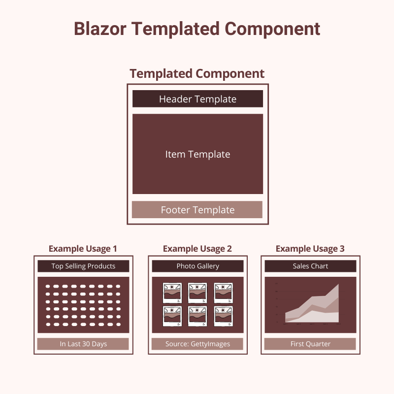
Blazor templated component is a type of component that accepts one or more UI templates as parameters. This facilitates component reusability because you just need to create a templated component once and then every page where that component is used can provide its UI template which can be rendered by the templated component as per the page requirements.
The examples of templated component include:
- A table component that allows a user to specify the templates for a table header, rows, and footer.
- A widget component that allows a user to render different widgets with the same look and feel but different contents.
- A list component that allows the user to specify a template for rendering the list items like bullets or numbers.
- A list component that allows user to display data in list, grid, or cards view
When we create a parameter of any Blazor component, we commonly specify its type as string, int, or any other built-in .NET data type. To create a templated component, we create component parameters of type RenderFragment or RenderFragment<T>. RenderFragment allows us to provide a segment of UI that can be rendered by templated components.
[Parameter]
public RenderFragment HeaderTemplate { get; set; }
RenderFragment<T> go one step further and allows us to pass the parameter of type T which can be used to customize the output of the templated component.
[Parameter]
public RenderFragment<T> RowTemplate { get; set; }
Getting Started with a Real World Example
To understand the templated components in detail, I have decided to build a TableWidget templated component that will allow us to customize the table header, rows, and footer in different formats. Let’s create a new Blazor Server App and add the basic functionality to rendering some data in table format before we create our first templated component.
Create a Data folder in Blazor Server App and add the following two model classes in the Data folder.
Product.cs
public class Product
{
    public int Id { get; set; }
    public string Title { get; set; }
    public decimal Price { get; set; }
    public int Quantity { get; set; }
}
Order.cs
public class Order
{
    public int Id { get; set; }
    public string OrderNo { get; set; }
    public DateTime OrderDate { get; set; }
    public string Status { get; set; }
    public decimal OrderTotal { get; set; }
}
Create a Services folder in the project and add the following IProductService and ProductService in the Services folder. For this tutorial, I am just returning some fake data to generate the table.
IProductService.cs
public interface IProductService
{
    List<Product> GetTopSellingProducts();
}
ProductService.cs
public class ProductService : IProductService
{
    public List<Product> GetTopSellingProducts()
    {
        return new List<Product>()
        {
            new Product()
            {
                Id = 1,
                Title = "Wireless Mouse",
                Price = 29.99m,
                Quantity = 3
            },
            new Product()
            {
                Id = 2,
                Title = "HP Headphone",
                Price = 79.99m,
                Quantity = 4
            },
            new Product()
            {
                Id = 3,
                Title = "Sony Keyboard",
                Price = 119.99m,
                Quantity = 5
            }
        };
    }
}
Next, create IOrderService and OrderService in the same Services folder and add some fake order data to generate a table.
IOrderService.cs
public interface IOrderService
{
    List<Order> GetLatestOrders();
}
OrderService.cs
public class OrderService : IOrderService
{
    public List<Order> GetLatestOrders()
    {
        return new List<Order>()
        {
            new Order()
            {
                Id = 1,
                OrderNo = "12345",
                OrderDate = DateTime.Today.AddDays(-2),
                Status = "Pending",
                OrderTotal = 399.99m
            },
            new Order()
            {
                Id = 2,
                OrderNo = "67890",
                OrderDate = DateTime.Today.AddDays(-5),
                Status = "Completed",
                OrderTotal = 199.99m
            },
            new Order()
            {
                Id = 3,
                OrderNo = "13579",
                OrderDate = DateTime.Today.AddDays(-7),
                Status = "Completed",
                OrderTotal = 249.99m
            }
        };
    }
}
We need to inject the above services in Blazor components using the dependency injection and for that purpose, we need to register the above services in Startup.cs file. If you want to learn more about dependency injection you can read my article A Step by Step Guide to ASP.NET Core Dependency Injection
Startup.cs
public void ConfigureServices(IServiceCollection services)
{
    services.AddRazorPages();
    services.AddServerSideBlazor();
    services.AddSingleton<WeatherForecastService>();

    services.AddScoped<IOrderService, OrderService>();
    services.AddScoped<IProductService, ProductService>();
}
Next, create a Blazor components Dashboard.razor and its corresponding code-behind file Dashboard.razor.cs in the project Pages folder. If you are not familiar with Blazor components and code-behind files then read my post A Beginner’s Guide to Blazor Components.
The Dashboard.razor.cs file will inject both IOrderService and IProductService in the code-behind file of the component and then we will use the methods GetLatestOrders and GetTopSellingProducts to populate our local Orders and Products lists.
Dashboard.razor.cs
public partial class Dashboard
{
    [Inject]
    private IOrderService OrderService { get; set; }

    [Inject]
    private IProductService ProductService { get; set; }

    private List<Order> Orders { get; set; }
    private List<Product> Products { get; set; }

    protected override void OnInitialized()
    {
        Orders = OrderService.GetLatestOrders();
        Products = ProductService.GetTopSellingProducts();
    }
}
The razor component view file will simply run foreach loops on Orders and Products and will generate the HTML tables.
@page "/dashboard"
<h1>Dashboard</h1>
<br />
<div class="row">
   <div class="col">
      @if (Orders != null)
      {
          <table class="table table-striped table-bordered">
             <thead class="thead-dark">
                <tr>
                   <th scope="col">Order</th>
                   <th scope="col">Date</th>
                   <th scope="col">Status</th>
                   <th scope="col">Total</th>
                </tr>
             </thead>
             <tbody>
                @foreach (var order in Orders)
                {
                    <tr>
                       <td>@order.OrderNo</td>
                       <td>@order.OrderDate.ToShortDateString()</td>
                       <td>@order.Status</td>
                       <td>@order.OrderTotal</td>
                    </tr>
                }
             </tbody>
          </table>
      }
   </div>
   <div class="col">
      @if (Products != null)
      {
          <h3>Top Selling Products</h3>
          <table class="table table-striped table-bordered">
             <thead class="thead-dark">
                <tr>
                   <th scope="col">Title</th>
                   <th scope="col">Price</th>
                   <th scope="col">Quantity</th>
                </tr>
             </thead>
             <tbody>
                @foreach (var product in Products)
                {
                    <tr>
                       <td>@product.Title</td>
                       <td>@product.Price</td>
                       <td>@product.Quantity</td>
                    </tr>
                }
             </tbody>
          </table>
      }
   </div>
</div>
If you will run the project, you will see the following two tables rendered on the page.
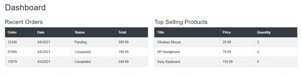
So far, we haven’t created any templated component but you can feel that we need one soon because both orders and products tables are shown above have almost the same look and feel and we are duplicating lots of HTML in the foreach loops above to generate these two tables. It is a good idea to create a templated component and then reuse that component to generate both of the above tables and still be able to customize the headers and data rows rendered by those tables. Let’s create our first templated component called the TableWidget component.
Creating a Blazor Templated Component
Add a new Razor component TableWidget.razor in the Shared folder and add the following code in it.
TableWidget.razor
@typeparam TItem
<br />
<h3>@Title</h3>
<table class="table table-striped table-bordered">
   <thead class="thead-dark">
      <tr>
         @HeaderTemplate
      </tr>
   </thead>
   <tbody>
      @foreach (var item in Items)
      {
      <tr>
         @RowTemplate(item)
      </tr>
      }
   </tbody>
   <tfoot>
      <tr>
         @FooterTemplate
      </tr>
   </tfoot>
</table>
@code {
    [Parameter]
    public string Title { get; set; }

    [Parameter]
    public RenderFragment HeaderTemplate { get; set; }

    [Parameter]
    public RenderFragment<TItem> RowTemplate { get; set; }

    [Parameter]
    public RenderFragment FooterTemplate { get; set; }

    [Parameter]
    public IReadOnlyList<TItem> Items { get; set; }
}
Our TableWidget component has the following three templates.
[Parameter]
public RenderFragment HeaderTemplate { get; set; }

[Parameter]
public RenderFragment<TItem> RowTemplate { get; set; }

[Parameter]
public RenderFragment FooterTemplate { get; set; }
The HeaderTemplate will allow users to render any UI template in the header of the table. This template is used to render the table header cells within thead element.
<thead class="thead-dark">
   <tr>
      @HeaderTemplate
   </tr>
</thead>
The FooterTemplate is similar to HeaderTemplate and it will allow users to render any UI template in the footer of the table. This template is used to render the table footer cells within tfoot element.
<tfoot>
   <tr>
      @FooterTemplate
   </tr>
</tfoot>
The RowTemplate is of type RanderFragment<TItem> and it will allow users to render the UI template using any .NET type. The type is not fixed and declared as a generic type using the @typeparam directives on top of the component.
@typeparam TItem
We also created a collection of TItem objects in our component so that we can iterate over the collection and generate our table rows
[Parameter]
public IReadOnlyList<TItem> Items { get; set; }
The type of objects we will pass in our UI template will render using the following foreach loop. You will shortly see how this will help us to render both Products and Order tables using the same TableWidget component.
<tbody>
   @foreach (var item in Items)
   {
       <tr>
          @RowTemplate(item)
       </tr>
   }
</tbody>
Different Ways to Use Blazor Templated Component
It is now time to see our TableWidget component in action and there are different ways we can use this component. Replace the Recent Orders table we generated above with the following TableWidget component.
<div class="col">
   @if (Orders != null)
   {
       <TableWidget Title="Recent Orders" Items="Orders">
          <HeaderTemplate>
             <th scope="col">Order</th>
             <th scope="col">Date</th>
             <th scope="col">Status</th>
             <th scope="col">Total</th>
          </HeaderTemplate>
          <RowTemplate>
             <td>@context.OrderNo</td>
             <td>@context.OrderDate.ToShortDateString()</td>
             <td>@context.Status</td>
             <td>@context.OrderTotal</td>
          </RowTemplate>
       </TableWidget>
   }
</div>
In the above code snippet, the Items property is initialized with the Orders list we received from our service. Then we decided to use HeaderTemplate and RowTemplate to generate the header and footer of the table. You may be thinking from where the context came from. The context is an implicit parameter available to all component arguments of Type RenderFragment<T>. We can use context to access the properties of the object we are dealing with. In the above example, context will supply the order information to the template.
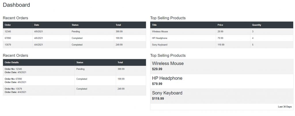
If you will run the project, you will see the following two tables rendered on the page. The Recent Orders table is now generated using our TableWidget component.
Let’s reuse our TableWidget component and this time generate the Top Selling Products table. This time, we are passing it Products list and we also specified our own Context=”product” which means we can now access product properties using product instead of implicit parameter context.
<div class="col">
   @if (Products != null)
   {
       <TableWidget Title="Top Selling Products" Items="Products" Context="product">
          <HeaderTemplate>
             <th scope="col">Title</th>
             <th scope="col">Price</th>
             <th scope="col">Quantity</th>
          </HeaderTemplate>
          <RowTemplate>
             <td>@product.Title</td>
             <td>@product.Price</td>
             <td>@product.Quantity</td>
          </RowTemplate>
       </TableWidget>
   }
</div>
You are allow allowed to specify the Context at template level as shown in the example where the Context=”product” is added to RowTemplate
<TableWidget Title="Top Selling Products" Items="Products">
   <HeaderTemplate>
      <th scope="col">Title</th>
      <th scope="col">Price</th>
      <th scope="col">Quantity</th>
   </HeaderTemplate>
   <RowTemplate Context="product">
      <td>@product.Title</td>
      <td>@product.Price</td>
      <td>@product.Quantity</td>
   </RowTemplate>
</TableWidget>
If you will run the project, you will see the following two tables rendered on the page but this time we know that these two tables are rendered using our TableWidget templated component. This example clearly shows that the same templated component can be used to generate different types of UI and it can render the different types of objects as per our app requirement.
Let’s reuse our TableWidget component with two more examples that will show the same Recent Orders and Top Selling Products with slightly different layouts
<div class="row">
   <div class="col">
      @if (Orders != null)
      {
          <TableWidget Title="Recent Orders" Items="Orders">
             <HeaderTemplate>
                <th scope="col" colspan="2">Order Details</th>
                <th scope="col">Status</th>
                <th scope="col">Total</th>
             </HeaderTemplate>
             <RowTemplate Context="order">
                <td colspan="2">
                   <b>Order No: </b>@order.OrderNo
                   <br />
                   <b>Order Date: </b>@order.OrderDate.ToShortDateString()
                </td>
                <td>@order.Status</td>
                <td>@order.OrderTotal</td>
             </RowTemplate>
          </TableWidget>
      }
   </div>
   <div class="col">
      @if (Products != null)
      {
          <TableWidget Title="Top Selling Products" Items="Products" TItem=”Product”>
             <RowTemplate Context="product">
                <td>
                   <h2>@product.Title</h2>
                   <h4><b>@product.Price.ToString("C")</b></h4>
                </td>
             </RowTemplate>
             <FooterTemplate>
                <td class="text-right"><b>Last 30 Days</b></td>
             </FooterTemplate>
          </TableWidget>
      }
   </div>
</div>
When using generic-typed components, the type parameter is inferred if possible. However, we have the option to explicitly specify the type with an attribute that has a name matching the type parameter, which is TItem in the above example.
If you will run the project, you will see all four tables rendered on the page using the same TableWidget templated component.
Creating a Generic Templated Component
Our TableWidget component is good and we have already seen different examples it can be reused but the problem with that component is that it only generates HTML tables. What if we want to create an even more generic component that can be reused to generate any type of UI e.g. tables, cards, bullets, etc. We can create such a component easily by removing all markup from the templated component. Let’s create a generic ListWidget component to see one such component in action.
Create a new ListWidget.razor component in the Shared folder and add the following code in it. This time, we have no markup in the component and we just have an ItemTemplate in the foreach loop. This means we are free to generate any type of list using this ListWidget component.
ListWidget.razor
@typeparam TItem

@foreach (var item in Items)
{
    @ItemTemplate(item)
}

@code {
    [Parameter]
    public RenderFragment<TItem> ItemTemplate { get; set; }

    [Parameter]
    public IReadOnlyList<TItem> Items { get; set; }
}
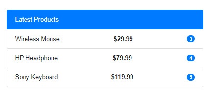
Let’s say we want to generate the bootstrap list using this ListWidget component so we can do this using the following code snippet.
<ul class="list-group">
   <li class="list-group-item d-flex justify-content-between align-items-center active">
      Latest Products
   </li>
   <ListWidget Items="Products" Context="product">
      <ItemTemplate>
         <li class="list-group-item d-flex justify-content-between align-items-center">
            @product.Title
            <b>@product.Price.ToString("C")</b>
            <span class="badge badge-primary badge-pill">
            @product.Quantity
            </span>
         </li>
      </ItemTemplate>
   </ListWidget>
</ul>
Run the project and you will see the same list of products are now generated as bootstrap list component.
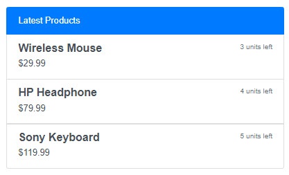
Now let’s say you have another page where the list of products need to be displayed differently using the div and a tags so once again you can reuse same ListWidget component and this time generate markup like the following:
<div class="list-group">
   <a class="list-group-item d-flex justify-content-between align-items-center active">
   Latest Products
   </a>
   <ListWidget Items="Products" Context="product" TItem="Product">
      <ItemTemplate>
         <a href="#" class="list-group-item list-group-item-action flex-column align-items-start">
            <div class="d-flex w-100 justify-content-between">
               <h5 class="mb-1"><b>@product.Title</b></h5>
               <small class="text-muted">@product.Quantity units left</small>
            </div>
            <p class="mb-1">@product.Price.ToString("C")</p>
         </a>
      </ItemTemplate>
   </ListWidget>
</div>
Run the project and you will see output similar to the following.
Summary
In this tutorial, I gave you an overview of the Blazor templated component and we created two types of templated components. Next, we have seen several examples of reusing both the TableWidget and ListWidget components to generate different types of markup. I have to admit that the templated components are a wonderful addition to the Blazor developer’s toolbox and using these components we can create some amazing reusable components.


Hm .. for now I get errors over errors when following your tutorial –
right at the point where you build Dashboard.razor.cs and Dashboard.razor –
the .razor.cs file doesnt know the types from Server/Data and the services from Server/Services
type or namespace “InjectAttribute” not found in ReusableSampleApp.Client – Dashboard.razor.cs
type or namespace “Inject” not found in ReusableSampleApp.Client – Dashboard.razor.cs
type or namespace “Order”, “Product”, “IOrderService”, “IProcuctService” not found in ReusableSampleApp.Client – Dashboard.razor.cs
Everything build in a new Blazor Webassembly , PWA with AspNetCore host to get the Server project