
Blazor is all about components. We create different types of components and reuse them throughout the project. Nobody wants to reinvent the wheel so it is always a good idea to create a library of reusable Blazor components that can not only be shared across multiple projects but can also be shared with others as a NuGet package. Blazor allows us to create such component libraries with the help of a new project template called Razor Class Library and in this post, I will show you how to create such a library and share not only components but also static contents such as images, stylesheets, etc.
Table of Contents
Creating a Razor Components Library
Create a new Blazor Server App with the name BlazorClassLibraryDemo in Visual Studio 2019. Make sure you can build and run your project without any problem. If you are not sure how to create Blazor Server apps then I will recommend you to read my post A Beginner’s Guide To Blazor Server and WebAssembly Applications
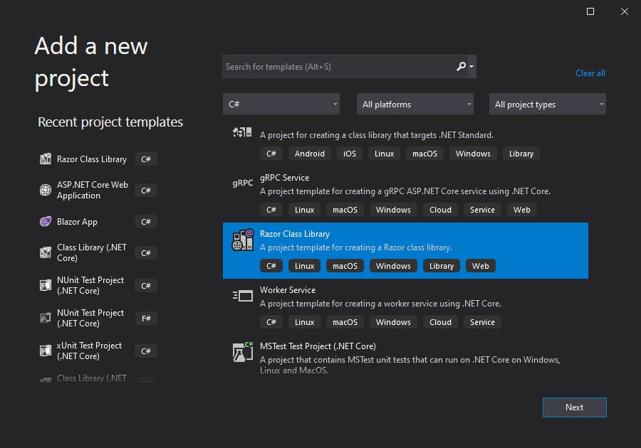
To add a new components library in your Blazor project, right-click on the solution and choose Add > New Project… option. Choose Razor Class Library project template from the list of available project templates
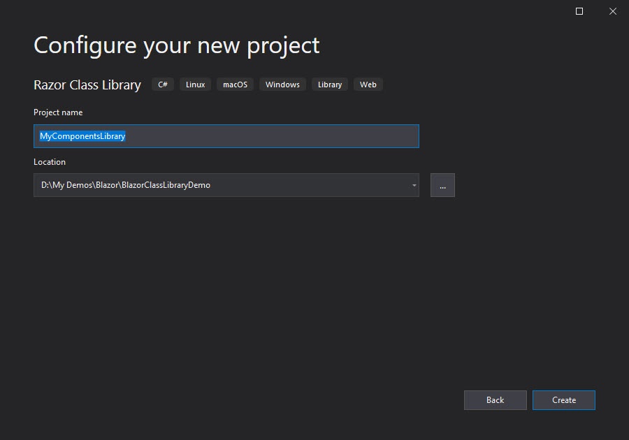
Give the project any suitable name, I have chosen the name MyComponentsLibrary.
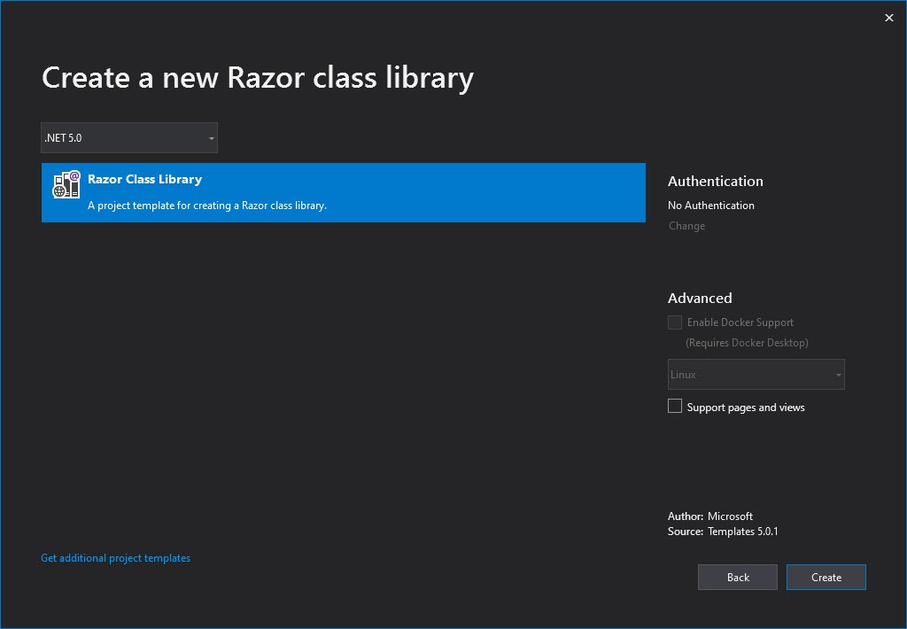
You will be asked to select the Project template once again with some additional options shown in the following dialog. There is only one item to select in this dialog so make sure Razor Class Library is selected and click Create button.
By default, the template will create an example component called Component1.razor with some additional files. Before we start creating our first shared component, we need to delete Component1.razor and ExampleJsInterop.cs as well as everything in the wwwroot folder so that we have a clean base to start.
Creating a Component in Razor Class Library
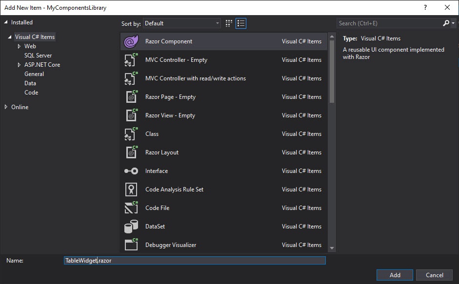
Let’s create our first reusable/shared components in the Razor class library project MyComponentsLibrary. Right-click on the class library project and choose Add > New Item… option. Select Razor Component template and give the component name TableWidget.razor.
You can also add a TableWidget.razor.cs code-behind file if you want to keep your C# code separate from the component view. The TableWidget component is a simple Templated component that can be used to generate HTML tables from any list of objects. If you want to learn more about Blazor Templated components then you can read my post A Developer’s Guide To Blazor Templated Components.
Add the following markup in TableWidget.razor component view file.
TableWidget.razor
@typeparam TItem
<table class="table table-striped table-bordered">
    <thead class="thead-green">
        <tr>
            @HeaderTemplate
        </tr>
    </thead>
    <tbody>
    @foreach (var item in Items)
    {
        <tr>
            @RowTemplate(item)
        </tr>
    }
    </tbody>
    <tfoot>
        <tr>
            @FooterTemplate
        </tr>
    </tfoot>
</table>
Following is the code-behind file of our TableWidget component. The component has Header, Row, and Footer templates of RenderFragment type to generate the header, body, and the footer of the HTML table in the view.
TableWidget.razor.cs
using System.Collections.Generic;
using Microsoft.AspNetCore.Components;

namespace MyComponentsLibrary
{
    public partial class TableWidget<TItem>
    {
        [Parameter]
        public RenderFragment HeaderTemplate { get; set; }

        [Parameter]
        public RenderFragment<TItem> RowTemplate { get; set; }

        [Parameter]
        public RenderFragment FooterTemplate { get; set; }

        [Parameter]
        public IReadOnlyList<TItem> Items { get; set; }
    }
}
Every reusable component we create in the Razor class library can also have its stylesheet to define the look and feel of the component. For example, if we want our TableWidget component to generate tables with the dark green header, we can define the styles of our component in the TableWidget.razor.css file.
TableWidget.razor.css
.thead-green {
    background-color: darkgreen;
    color: white;
}
Consuming a Razor Component from Razor Class Library
Now we have defined our TableWidget component in the class library project, it is now time to use this component in our Blazor project. Right-click on the Dependencies node in the solution explorer and choose Add Project Reference… option from the context menu. Select the MyComponentsLibrary project and click OK.
If you want to use the TableWidget component on multiple pages then it is recommended to add the reference of the library in _Imports.razor file.
@using MyComponentsLibrary
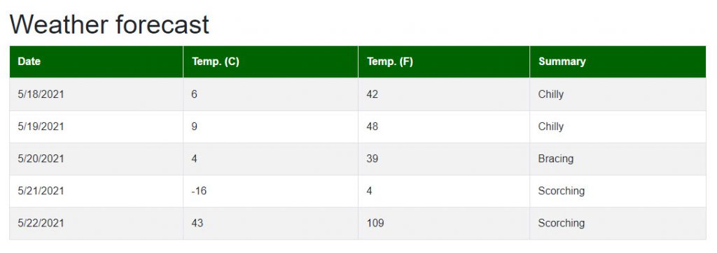
Blazor project template generates a FetchData.razor page by default that displays weather forecast objects from a backend service. We can test our TableWidget component on this page. Open the FetchData.razor file and replace the HTML table with the TableWidget component as shown in the code snippet below.
FetchData.razor
@page "/fetchdata"

@using BlazorClassLibraryDemo.Data
@inject WeatherForecastService ForecastService

<h1>Weather forecast</h1>

@if (forecasts == null)
{
    <p><em>Loading...</em></p>
}
else
{
    <TableWidget Items="forecasts" Context="forecast">
        <HeaderTemplate>
            <th>Date</th>
            <th>Temp. (C)</th>
            <th>Temp. (F)</th>
            <th>Summary</th>
        </HeaderTemplate>
        <RowTemplate>
            <td>@forecast.Date.ToShortDateString()</td>
            <td>@forecast.TemperatureC</td>
            <td>@forecast.TemperatureF</td>
            <td>@forecast.Summary</td>
        </RowTemplate>
    </TableWidget>
}

@code {
    private WeatherForecast[] forecasts;

    protected override async Task OnInitializedAsync()
    {
        forecasts = await ForecastService.GetForecastAsync(DateTime.Now);
    }
}
Run the project and you should see the weather forecast grid generated using our TableWidget component. You can now reuse the TableWidget component in multiple pages or projects and you will always see the same grid generated for you.
Consuming Images from Razor Class Library
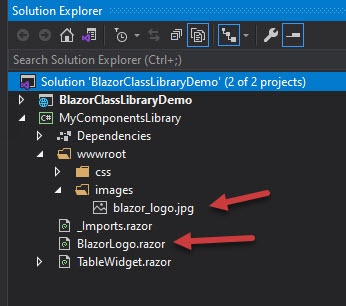
Razor class libraries can expose static assets such as images and these assets can be consumed by the Blazor apps that consume the library. Let’s add an image blazor_logo.jpg in the wwwroot/images folder of our MyComponentsLibrary project. To use this image inside a Blazor component, add a component with the name BlazorLogo.razor in the MyComponentsLibrary project.
Add the blazor_logo.jpg image inside the BlazorLogo.razor component using the simple img tag.
BlazorLogo.razor
<img src="images/blazor_logo.jpg" alt="Blazor Logo"/>
To use the BlazorLogo.razor component in the Blazor app, open the Index.razor page from the Blazor demo app we created above and directly use the BlazorLogo component as shown in the code snippet below.
Index.razor
<h1>Hello, Blazor!</h1>

<BlazorLogo></BlazorLogo>
Run the project and you will notice that the image is not rendered as you expected. This is because the relative path of the image images/blazor_logo.jpg is not accessible from outside the class library project.

To fix the above problem, you need to use a special path syntax given below:
_content/{Razor Class Library Name}/{Path to file}
In the above syntax, the {Razor Class Library Name} is the placeholder for the class library name e.g. MyComponentsLibrary. The {Path to file} is the path to file under wwwroot folder.
Let’s fix our image path using the special syntax describe above
BlazorLogo.razor
<img src="_content/MyComponentsLibrary/images/blazor_logo.jpg" alt="Blazor Logo"/>
Run the project again and this time you will notice that the image is rendered as expected.

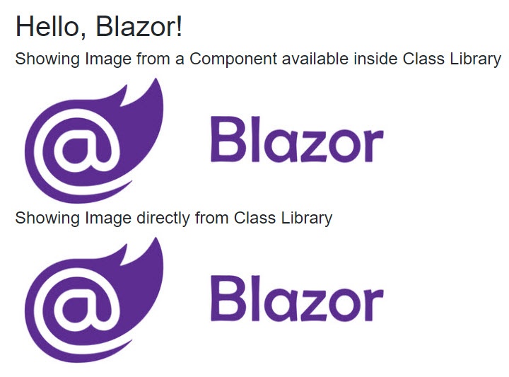
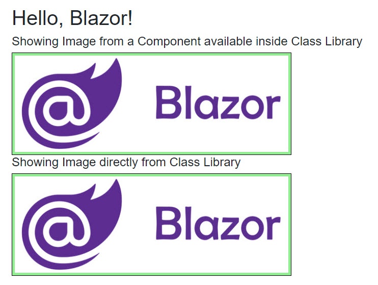
We can also access the images from Razor class libraries directly using the above special syntax. For example, the code snippet below will display images from the Razor class library using the BlazorLogo component as well as using the img tag. Notice the same special syntax is used with img tag in the Blazor app to access the image available in MyComponentsLibrary
Index.razor
<h1>Hello, Blazor!</h1>

<h4>Showing Image from a Component available inside Class Library</h4>

<BlazorLogo></BlazorLogo>

<h4>Showing Image directly from Class Library</h4>

<img src="_content/MyComponentsLibrary/images/blazor_logo.jpg" alt="Blazor Logo" />
Run the project once again and this time you should see the same image rendered twice using both approaches.
Consuming Stylesheets from Razor class library
We can also add stylesheets in Razor class libraries and the styles defined in those stylesheets can be used by Blazor apps. Let’s add a stylesheet components.css inside wwwroot/css folder
For the demonstration purpose, let’s add some styles related to img tag
components.css
img
{
    background-color: lightgreen;
    padding: 5px;
    border: 1px solid black;
}
To include the components.css file in our Blazor app, we can use the same special syntax we saw above. Open the _Host.cshtml file available in our Blazor server app and include the components.css file inside the head tag using the following link tag.
_Host.cshtml
<head>
    <meta charset="utf-8" />
    <meta name="viewport" content="width=device-width, initial-scale=1.0" />
    ...

    <link href="~/_content/MyComponentsLibrary/css/components.css" rel="stylesheet" />
</head>
Run the project and you will notice that the styles related to img tag we defined in the components.css file are applied to all the images of the projects.
Summary
I have covered very basic examples of reusable components in this post but you can see the power of the Razor class library. Developers can create some cool and amazing libraries of reusable Blazor components that can not only add some advanced features to your project but also increase the development speed. Many component vendors already developed some open source and commercial libraries such as MatBlazor, Radzen, Syncfusion, etc.


Hi !
Thank you for this post. It’s running perfectly.
But I wonder how we could make the headers clickable in order to manage table sorting…
Any clue on how to do that with templated component?
It would be great if you could provide an exemple.
Thank you again.
Hi there thank you for this great article. However, I am getting an error message below and not sure how to resolve it:
Severity Code Description Project File Line Suppression State
Error CS0411 The type arguments for method ‘TypeInference.CreateToolsTableWidget_0(RenderTreeBuilder, int, int, RenderFragment, int, RenderFragment)’ cannot be inferred from the usage. Try specifying the type arguments explicitly. BusinessPlanOnline C:\Projects 2021\BuinessPlan\obj\Release\net5.0\Razor\Components\_BusinessEnvironment01.razor.g.cs 181 Active
This error would occur when the generic Blazor component is unable to infer the type argument from the parameters. So, the compiler does not know which type of argument is intended. Can you double check if you are following the steps shown in this post properly?
When using generic-typed components, the type parameter is inferred if possible. However, we have the option to explicitly specify the type with an attribute that has a name matching the type parameter. You can specify ITtem attribute with the component as follows:
<TableWidget Items="forecasts" Context="forecast" TItem="WeatherForecast">
If you want to learn more about this technique of using Blazor components then read my post A Developer’s Guide To Blazor Templated Components
Yayy thank you Waqas, I got this running. This is amazing
Thanks again.