
ASP.NET AJAX Controls Toolkit contains many useful controls which you can use to provide rich user interface for your website. One such control is Accordion control that allows you to provide outlook style user interface by showing one of the multiple panes. It can be used to create expandable/collapsible navigation bars or to display page contents which user can expand and collapse to view one pane at a time. In this tutorial I will show you how you can implement Accordion control in your ASP.NET websites.
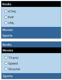
The Accordion control acts as a container of AccordionPane controls and it keeps track of the current AccordionPane and automatically hides any other AccordionPane if it is visible. The AccordionPane controls has Header and Content templates to display heading and contents of the pane. The following figure shows two different views of AccordionPane controls inside Accordion control.
To start this tutorial, I have created a new page which has a ScriptManager control on the top. This control is required every time you want to use any AJAX feature or control on you website.
<asp:ScriptManager ID="ScriptManager1" runat="server"></asp:ScriptManager>
Next I have added the following markup for the Accordion control including its nested AccordionPane controls.
<ajax:Accordion ID="Accordion1" runat="server"
   HeaderCssClass="Header" ContentCssClass="Contents"
   HeaderSelectedCssClass="SelectedHeader"
   Font-Names="Verdana" Font-Size="10"
   BorderColor="#000000" BorderStyle="Solid" BorderWidth="1"
   FramesPerSecond="100" FadeTransitions="true"
   TransitionDuration="500">

   <Panes>

      <ajax:AccordionPane runat="server" ID="AccordionPane1">
         <Header>Books</Header>
         <Content>
            <asp:RadioButtonList ID="RadioButtonList1" runat="server">
               <asp:ListItem>HTML</asp:ListItem>
               <asp:ListItem>PHP</asp:ListItem>
               <asp:ListItem>XML</asp:ListItem>
            </asp:RadioButtonList>
         </Content>
      </ajax:AccordionPane>

      <ajax:AccordionPane runat="server" ID="AccordionPane2">
         <Header>Movies</Header>
         <Content>
            <asp:RadioButtonList ID="RadioButtonList2" runat="server">
               <asp:ListItem>Titanic</asp:ListItem>
               <asp:ListItem>Speed</asp:ListItem>
               <asp:ListItem>Shooter</asp:ListItem>
            </asp:RadioButtonList>
         </Content>
      </ajax:AccordionPane>

      <ajax:AccordionPane runat="server" ID="AccordionPane3">
         <Header>Sports</Header>
         <Content>
            <asp:RadioButtonList ID="RadioButtonList3" runat="server">
               <asp:ListItem>Football</asp:ListItem>
               <asp:ListItem>Cricket</asp:ListItem>
               <asp:ListItem>Snooker</asp:ListItem>
            </asp:RadioButtonList>
         </Content>
      </ajax:AccordionPane>

   </Panes>

</ajax:Accordion>
The following section explains some of the Accordion control properties in detail.
SelectedIndex: As I mentioned above the Accordion control can have multiple AccordionPane controls inside its Panes collection so this property specifies which one of those panes you want to make it visible when the page first loads. You can set it to 0 to display the first or top pane.
HeaderCssClass: This property needs the name of the CSS class that you want to use to style the header section of all the AccordionPane controls inside Accordion control. You can also specify styles for individual AccordionPane controls by settings AccordionPane property instead of setting this property at Accordion control level.
HeaderSelectedCssClass: This property specifies the name of the CSS class you want to use for the selected AccordionPane header. This property can also be set for individual AccordionPane controls.
ContentCssClass: This property specifies the name of the CSS class you want to use to style the content area of the AccordionPane controls.
The CSS classes I have used in this tutorial are shown below.
<style type="text/css">

.Header
{
   background-color: #000000;
   color: White;
   padding: 4px;
   font-weight: bold;
}

.SelectedHeader
{
   background-color: #808080;
   color: White;
   padding: 4px;
   font-weight: bold;
}

.Contents
{
   background-color: #f3f3f3;
   padding: 5px;
}

</style>
FadeTransitions: This is a Boolean property to specify whether you need the fading transition effect or standard transition effect for AccordionPane controls.
TransitionDuration: This property needs the number of milliseconds you can to set to increase or decrease the speed of transition effect.
FramesPerSecond: This property specifies the number of frames per second the Accordion control will use to animate the transition between AccordionPane controls.
The Accordion control has Panes collection which contains the collection of AccordionPane controls as you can see in the above markup. I have used simple static text in the Header template and RadioButtonList controls in the Content template of each of the above AccordionPane controls but you are free to use any control or contents you want in your applications.
The Accordion control can also be data bound. It has DataSource and DataSourceID properties which can be set just like other ASP.NET standard data bound controls. The Accordion control also has HeaderTemplate and ContentTemplate properties which you can use to set you data items when Accordion control is data bound.


THANK U VERY MUCH SIR
I WILL TRY TOMORRY THIS CODE.
RIAZ
PUNJAB INSTITUTE OF CARDIOLOGY